The field of interaction design has been shaken in the last year as it hasn't been since the Xerox Parc, more than 20 years ago. The old metaphors of desktops and the idea that the mouse is the center of our universe are being radically changed by mainly three mainstream products: the Wii, the iPhone and – of course, since you are reading OLPCNews – the XO laptop.
You probably know about the Motion Sensors on the Nintendo video game, and about all the multiTouch going on with the apple phone, but do you know why the "$100 laptop" interface experience, called sugar, is radically different from any other operating system on the market? And why not?
Because you don't like the icons. They don't have any eye-candies, do not look 3d, have no drop shadows and no floor reflections. The icons looks childish, the graphics seems like it was designed for a computer with no dedicated video-card and almost no RAM. Guess what – they were.
To fully understand the wonderful work that created the sugar interface you had to see beyond your prejudices (and read a long very technical text or watch a video). This article is a guide to the basics of Sugar user experience, translated for those adults which have been spoiled by years of Mac or Windows use. The underlying principles are the same, but the elements of the graphic user interface appears here rendered as if they were in the Mac OS X Aqua interface:
First Principles:
Most commercial interfaces were designed originally for office workers wanting to remain undisturbed on their own cubicles. The fingerprint remains, and most windows and macs are still built for single users doing multiple works. The XO laptop was designed to incite collaborative works amongst students. Therefore, sharing files, connecting to friends, P2P downloading of programs, social networking and multiplayer games are not separated applications, but integrated on one experience with the Operating System.
Also the screen – although handling twice the resolution of most conventional monitors – is only 7.5 inches. So all programs run in full screen mode. Again, it's not a computer made for a single user doing multiple tasks at the same time. It's designed so that multiple users can collaborate on a single task.
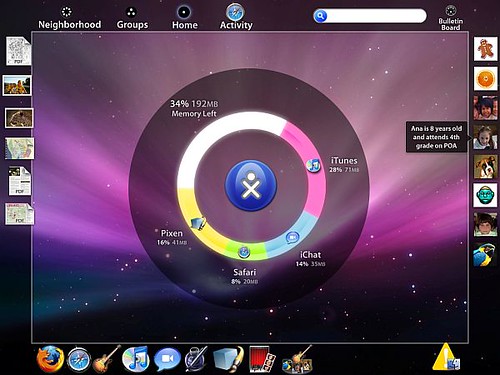
The FrameThe most important GUI element is the Frame. It appears when the mouse moves beyond any side of the screen, or when the button is pressed on the keyboard. The four sides are (clockwise from the right side): persons, actions, objects and places. Or if you prefer: the buddy list, the dock, the clipboard and the menu bar.
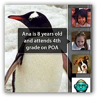
The buddy list is sort of iChat meets twitter meets social network, all integrated in your OS. But instead of being a list of online buddies, it displays the friends who are engaged on the same activity as yourself. See all people that are reading the same book, or working on the same report, or playing the same game that you are right now. Mousing over the icons will display a short profile with name, age, interests, class and etc.
The bottom bar is the dock, which work mainly as an Applications Activity launcher and a system tray. Here will reside all the applications he have already on his computer, and also any pending invitation to download a new app join a new activity. All systems messages, appears on the dock, in the order they are received. Because the system is designed to keep the user concentrated on the task he is currently in, those will not pop up automatically, but instead will appear minimized until they are read and the appropriate action is taken.
On any OS the clipboard is an essential feature that everyone takes for granted, so much to the fact that it almost hasn't changed at all over the years. Because sharing files is so important to the XO experience, the left bar works as a multi-slot, always-visible clipboard.
A temporary place to keep objects to be able to move between activities, on multiple places (see below), or to the bulletin board (which will be explained later). Everything that is copied with the usual keystrokes appears on top of the objects bar, but they can be also dragged in or out directly from web pages, from documents or any other application
And finally on the top you have the menu bar or better referred to as Places bar – since there are no menus on it. At the far right there is the Dashboard Bulletin Board and the spotlight global search field both of which will be discussed later. On the far left, there are four icons which stand for the aforementioned Places. The XO was is designed to be used in many ways, ranging from privately doing some work, to doing it on a selected group or in an open environment where everyone is invited. It's on those icons that you set those preferences.
The Places
Unlike most systems, the privacy/collaboration settings are chosen even before launching an application. Every application activity on the XO can be launched initiated at multiple places, depending whether you want to work privately or with friends, and which ones. If you start an application on your own home, you will be working on it without anyone knowing, but if you start an application on a friends group or on the neighborhood you are implicitly inviting anyone on that place to join you.
Neighborhood
The most broad sharing level is Neighborhood. Every icon represents one XO laptop that is detectable on your mesh network and what activity (if he allows it) the user is in right now. This map represents multiple things:
- Your state of connectivity: as every laptop also represent a router that extends your wireless connection, the more icons you have on the screen the more reliable you connection will be
- The social interactions going on. Here you can see at a glance all the people that are on close to you and which activities they are doing right now. It's like coming to a party and seeing a bunch of friends gathering in multiple circles, around the fire or around a guitar.
- A peer to peer distribution of applications. Every task you see active represents laptops running a program in sugar, even if you don't have this program on your own machine. By clicking on one activity the laptop will download the latest application version available from your peers, install and run it for you.
- All sugar apps are portable, which means that by installing or uninstalling an application you are in fact just copying or deleting one file. And thanks to the bitfrost security, all programs are restricted to a closed sandbox with no special permissions (like copying itself or snitching data) making spyware simply unfeasible.
Groups

The next zoom level is you Groups. Here you can see only who is on your friends list and what they are doing now. Again all activities that are on this group represent a implicit invitation for you to engage in.
Instead of highly restrictive and always breakable, the digital parental control which allows or disallows certain applications relies on a very low tech social supervising.
A teacher or a parent on the network cannot tell what every kid is doing with their laptop. But he or she can tell what he is not doing. All collaborators to a project are visible, and all laptops on the same Group can be viewed if they are engaged in something on this zoom level. If a student – or more than one – is not doing what they are supposed to be doing, this will be apparent, much like a teacher in a class can see which students are sleeping, playing or simply just not paying attention.
Also the groups restrictions are very loose in order to leave space for natural social dynamics. Anyone in the group can invite more members, and everyone else will be notified and introduced to him (as a minimized alert on the system tray bar).
Home
The Home level is the computer itself. This is also the most private starting point, and all applications activities started here will be invisible on the network until the user drags it to another broader level. Observe that the default behavior of Windows and OS X, is no more than a special case on the Sugar experience.

The central ring is at the same time a task switcher and the Activity Monitor, where one can see which applications are running and how much memory they are using. Every application running will appear on the circle, filling an area proportional to how much memory it uses, and when the circle is full no new applications will be allowed to run before you close some. Dragging any app from the Dock to the Ring will launch it, and dragging it out of the ring will quit it.
The XO memory is scarce and this allows any children to understand visually how much space is left and to easily identify the memory suckers slowing down the system. Something many other OS'es could use.
Application
The main function of all Places is to help the users engage in Activities. But when he finds one, he will go to the Application Activity level. The place the activity was set reflects whom he will be collaborating with– either only with himself, among his friends or with the whole neighborhood. At any point the privacy level of one document can be changed, but this will reflect only on his own copy. Therefore, one can pick a copy of the current work and take it "home" so he can work on it by himself and only later share with the group. Or one can share that document with other groups or a bigger neighborhood.
But how documents are shared? Where are they saved? Where is the file explorer app? In the next part of this post, we will explore how the Bulletin Board – a Dashboard to share files – and the journal, where all the old metaphors of office automation, saving and archiving files are replaced by a more modern, almost blog like way of organizing your data.
Nice video Alexandre.
If only people could work together better then Sugar would indeed have a place as a real OS for adults.
Unfortunately many computer users are ingrained with an isolationist attitude and only see the the world through an Instant Messenger or their Blog or even their MySpace page.
I guess not having had applications that we can share with others has made us this way. The closest we came to this was Microsoft Netmeeting with shared activities like the whiteboard etc. None of those really made it into future incarnations like MSN Messenger because people dont like to share.
It will be interesting to see where Sugar leads us. I'm sure it has a sweet future.
yes Robert, I agree that maybe the isolationist attitude of a typical computer users comes from the interfaces. But then, most of sugar innovations are inspired by the web, made from those users, so we are always in a nice circle..
Robert, that isolationist attitude didn't prevent the creation of the Sugar interface, the Linux OS upon which Sugar runs, the browser I'm using to read your post and respond, the server that served up the web page and most of the software involved in moving your complaint about the inadequate supply of teamwork attitude around the internet.
To get back to the Sugar interface, thanks for posting the alexandre. I hadn't given Sugar much thought, assuming, I suppose that Sugar was tied fairly closely to the hardware and the mission and thus only of academic interest to me but I'm now inclined to see if I can get it running on my computer.
Some links relevant to the article:
Flickr set with Hi-res screens
http://flickr.com/photos/avsa/sets/72157602990442744/
More information of the video (including link to download it as quicktime):
http://one.revver.com/watch/459969/
This one should be submitted to Slashdot/DIGG/etc. That's an impressive look for Sugar.
http://digg.com/design/Aquatic_Sugar_The_Children_s_Interface_Translated_for_Adults
It's been dugg. :)
And delicioused and stumbled, but I don't have a slashdot account, so, can someone else do the honors?
can't slashdot it, someone else has blocked the url
WOW!
I'm amazed. It's a beautiful thing. But I think maybe instead of blaming people's spoiledness for the slow growth of interest in Sugar, maybe we should look at the fact that the OLPC website / laptop.org does not have a demo or explanation of the OS that's even remotely as well done as the ones above. If they did, maybe there's be a lot more growth of interest.
2 things
1. very cool looking suped up sugar interface
2. i'm still of the opinion that the ideas and philosophies behind sugar could be done better. honestly i would like a sort of contest with an emphasis on collaboration between people to see if any one, or groups of people, could come up with a system that would be more space efficient, even easier to use and in my humble opinion/wish, a little better looking (i think the colors and designs of icons could be done a little better).
There are other group collaboration systems out there, as well: Ray Ozzie's "next big thing" after Lotus Notes was Groove, which has adds a 'gesture' layer to the MVC architecture. Groove was acquired by Microsoft, but it is still out there.
Keep the development work, graphic design, and product management moving.
It's just a theme for the Sugar UI that emulates the Mac interface. Or Sugar UI running on a Mac rather than an OLPC laptop. That might explain why iChat and Safari are running since the OS for the OLPC is definitely linux.
--------------------------
Marvin
http://www.widecircles.info
Is "Aquatic Sugar" at all available for download/use?
Dears,
I was trying to write down my real-hard-office-work requirements, where I reached to something like SUGAR, so, I started googling to see if it was already there, I've reached this page, I am using linux, and I was thinking why linux is trying to clone "old" operating systems interfaces, while it is an open area for creativity, I think linux deserves such an interface to become it's default interface.
Uh, there can't be a default interface for GNU/Linux because there are many: KDE, GNOME, XFCE, and a ton of window managers like PekWM and Fluxbox. I doubt that anyone would be able to agree on a default layout. For example, GNOME has panels on the top and bottom of the screen by default. KDE 4 has a rounded bar with stacked icons.
I installed sugar on my linux, actually it is still so chidish and does not reflect any of the above ideas or interfaces. >
I've installed it, too. It's meant to be childish, but I wasn't disappointed with it. The reason it's so simple is so that even illiterate kids can use the interface. I'd tear it off, myself. Way too simple for my tastes. I prefer environments like GNOME or Xfce. I also think Fluxbox and PekWM can be very nice once they're set up. With the OLPC, PekWM/Fluxbox and Tint2 would be the lightest with the most usability, but you'd need to be able to read first.
Every time I look at this interface, I love it. Even two years later, its still clock stopping hot
It's really true. I've had my ups and downs using Sugar daily as a desktop UI, since it has a small developer base compared to kde or gnome, but the general interface design is fantastic.
It is so much better than the 'smartphone' UI designs for droids and iphones, and so inherently scalable, that I'm amazed those devices haven't started experimenting with something similar.