OLPC XO-1 Sugar UI
Now that the One Laptop Per Child's Sugar User Interface is somewhat baked and out in the wild, usability experts are starting to review it in detail. While everyone gives full credit to the OLPC XO team for creating a different look and feel, Thom Holwerda and Harry Brignull aren't sounding like fanboys in their separate reviews of the Sugar UI.
First Thom Holwerda is clear in his post title The OLPC Sugar Interface: Don't Do it. Thom seems to dislike the very effort of creating a new user interface, radically different from the current Windows, Apple, or Linux experience:
What the OLPC team is doing is creating a whole new paradigm for their laptop's interface, and this brings with it various difficulties, even though there is absolutely no need for this.Then Harry Brignull gives us his opinion on Why the OLPC needs lots of usability work:Children in the 3rd world are not magically less competent than us Western kids, and hence there is no need for a special interface. Just give them what has been proven to be an easy to understand and use system, and focus on the things that really matter (price, distribution, resource management).
Building a UI is like making a pair of shoes. Creativity is all well and good, but ultimately they have to fit the person you are making them for or they aren’t walking anywhere. While lots of hard work has gone into the UI design so far, it seems they are getting ahead of themselves and chasing their own dreams.I'll have to disagree with both Thom and Harry. The OLPC team is brave and right in redesigning the user interface. From children in the developing world I've tried to teach to my own Mom, I constantly see confusion and frustration with both Windows and Linux user interfaces. I haven’t used Apple interfaces enough to judge others' reaction, though I know I find it disconcerting personally.The whole ‘breaking away from the desktop’ smacks heavily of academics who have finally found an outlet for their wacky ideas. Creativity is of course very important, but it has to be tempered within the requirements of the target audience.
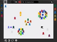
In playing with the Sugar UI, I see a complete rethink that only academics could pull off. A reorientation of the computer from a cold tool to a trusted playground. A place to connect with friends and activities, which I can't wait to venture into on my very own Children's Machine XO neighbourhood.
But enough of what we think about the OLPC Children's Machine Sugar UI. Take a tour of Sugar with another great video by Harry Brignull. Check out OLPC XO-1's social features, the follow-up to Harry's excellent Sugar UI Demo:
So what's your opinion? What is you review of the Sugar UI? Is Sugar a paradigm shift in children's interaction with computers or an academic power trip?The comments section waits!

This auto-hidden panels have some serious issues.
The neighbourhood, friends, home, activity should behave like a cube (as in the beryl/compiz project).
Rotating a cube is more comprehensible, as assigning names to the virtual desktops(neighbourhood, friends, home, activity).
Because these 'desktop metaphors' are nothing else as the virtual desktops available in gnome, kde, etc.
But its true, if somebody figure out how to use it, after he wont have problems with any gui (windows, linux(kde, gnome), osx).
And the webwrowser without an url bar, is nothing about the usability, its just pure marketing to google. Its shame, that its really about this: money.
(if its not clear to somebody: any webpage is accessible trough google, as there is no url bar, and the start page is the google.com)
The OLPC team are doing a very admirable job, but they are designing for a very tricky user group. The only way they are going to be sure they are on the right track is to carry out extensive user testing.
Our opinions really don't count for much - it's all about whether the UI is suited to the end-users. Lets just hope that some genuine user testing is going to be carried out and will feedback into the design process before the laptops are fully deployed.
I'd like to add that the YouTube video is only a mock-up based on the specifications and stills provided on the OLPC Wiki. It is *not* a live demo.
BTW the web browser does have an address bar - the title bar doubles up as an address bar, to save on real estate. (This does raise questions about phishing but that's another discussion for another day).
Khiraly> I've seen an address bar in one of the videos of Sugar, and the demo-er typed an address inside it.
i think my versions are much more friendly and colorful, this UI is not for children, it is boring..
http://nuanceworkshop.eu/etc/olpc-sugarui-concept-s.jpg
http://nuanceworkshop.eu/etc/olpc-sugarui-concept-v.jpg
I'm impressed with the UI, although it's obviously a work in progress. The thing I like most is the network views: Friend & Network. I'm wondering how they will scale though, as the People side of the frame appears to only have space for 10 or 11 icons. I also wonder if there will be a way to change your icon from the X0 color combo to something else; it might be difficult to remember who is what color combo. I also notice that they haven't used the corners for anything, even though I'm sure they know that the corners are the easiest target to hit.
I really like having the Objects bar on the left, but again it would be nice if it showed some graphic representation of what the clipping is, rather than a generic document icon in some combo of colors. Do the colors signify the source? Also, how will this scale when there appears to be only room for 10 to 11 icons.
As for the address bar in the browser, I'm sure that will get put in sometime in the beta process. They also haven't showed how the shared web-browsing might work.
On the B1-demo-notes page there are some new icons in the places bar, one for shutdown, and another one that has increasingly taller bars (battery or wireless?). It would be nice to have some indication of the network, that is, how many people I'm connected to, and whether I'm connected to the Internet.
Not directly connected to the UI, but from watching the DOOM video, it's obvious they need a couple more buttons in the Game buttons cluster. Or if they went with a straight touch-screen instead of the huge stylus pad.
There's a telling story reading through the list of problems and defects both with the Sugar UI and with the hardware. Its interesting that OLPC are making the development of the laptop so out in the open for us all to see at http://dev.laptop.org
Ticket #507 is regarding the Wireless antennas becoming loose after a week of use and 'flopping over'. Sounds like some serious issues are coming to light as they get put through their paces.
Another ticket mentions the activities not closing properly. Sugar thinks they are closed but they keep on running.
I wonder what these laptops will be like after a bunch of kids get through with them?
Robert,
The whole point of the B1 test is to find these sort of problems and fix them. The fact that problems have been found is not "telling story", its proof that theoritcal designs need testing. Who'd have thought that eh?
As for "Wait till kids get their hands on them", they are and the laptop is being put through some pretty destructive testing.
Re: Robert:
The "telling story" is that this is the first version of the hardware and the first version of the software. Do you think the ipod was perfect the first time it rolled off the line? Just because you only saw the final product doesn't mean there weren't problems with the prototypes.
As the olpc develops over the next year, all of these problems will be addressed, and kids in Brazil won't have any idea that the game keys suck right now, or the touchpad blows. If anything, the testing will be more rigorous with the olpc because the whole process is open.
With a million laptops per shipment they had better make damn sure there are no faults. Imagine the expense of one million batteries exploding! Just ask all the laptop companies recalling those batteries.
How does the Ipod scale in comparison to OLPC?
Its an interesting similarity in some ways. Retail price comparison is close, will there ever be as many Ipods as OLPCs?
Will we see joggers running through parks with their OLPC they picked up on Ebay flapping around as they run? The headphone socket should be useful.
Or are we more likely to see school kids walking home with nothing else but their OLPC over their shoulder? They wont need schoolbags any more! Where will they carry their lunch?
Should these laptops have a compartment to carry food in?
I disagree with the notion that this is a daring and novel interface. Yes, maybe there are some quirks with the default Windows interface, the various Linux GUI's (KDE, Gnome, XfcE etc) or Mac OS X. But what is the main goal of the OLPC project? If you ask me it was meant to put a brigde over the digital divide. The Sugar UI is not helping. On the contrary, it may only make matters worse. Like it or not, the standard for IT use is being set by the rich and powerful.
My main critique against the current OLPC interface are twofold:
(1) it is not intuitive. What must a kid conclude when he sees a penguin sitting behind a TV? Of course, he/she immediately thinks "RSS feeds!".
(2) three out of five applications (Chat, RSS feeds and WWW) require an internet connection. That makes the usability of the OLPC dependent on outside investments. That diskspace was better used to get more featured version of Abiword on the laptop and Gnumeric to teach the kids mathematical stuff.
Maybe, as Owen Williams says, this is just the first version of OLPC and quirks are about to get ironed out in the future. There is but one problem: the countries, people and parents that buy the OLPC don't have the resources to buy upgrades. There is plenty of experience out there that could have been used.
Jan:
The current software is just alpha-level "hey it works!" stuff. The only reason penguintv is on there is because I made it work on there. It's also a good testbed because it has a lot of dependencies and stresses the system well. If penguintv can be made to run well, then all of the educational software you'd expect will probably run well.
Once the underlying framework settles down (which is where we are at now) the work can begin on the top-level software the kids will actually use. Many of the current activities are placeholders because we had to start somewhere.
ps, the batteries are NiMH, which don't explode. There is also very little of anything toxic inside there too.
I don't think a lot of third world children will grasp this operation system. It's non-linear and fairly abstract. The icons, I believe, will have little meaning to people who haven't touched a computer before.
The OS should first off prompt the user for their picture. Then the icons for all the people in the neighborhood should be replaced with their pictures. Everything should be represented with a proper picture.
For example, the chat balloon icon is something familiar in Western culture due to its ties to reading comics. For most of the world, a speech balloon means nothing. Two heads facing each other talking would be easy to understand.
The strange globe icon should be represented by a simple earth icon. The easel icon should be replaced by a single large paint brush, and a simple letter on a piece of paper should replace the pencil and paper icon for text documents, as it's easily confused between text and painting.
Multitasking applications need to be represented by 'slightly' animated icons, which allows the user to know that something is still going on while they are doing something else.
Mouse-over operations should never be implemented - always display the information. Nothing should be 'out of the way' in this system.
Just my thoughts by looking at the video.
About thirld world kids not grasping the concept of OS, chat, speech ballons, etc.
Have you seen a kid starting to use a computer? They don't try to "understand" it just as they don't try to understand a ball or a pencil. They simply start using them, taking them as they are. The abstractions will come later naturally.
Using pictures for people would make it nicer, of course. Easier for kids can't read yet. However, I don't think any kid would need more than a day to get the whole picture even without these.
I agree with Thom Holwerda and Harry Brignull, other kids, just cus they are underpriviledges arent less capable then us, and to Wayan, i understand trying to teach other people, even in the "tochnological world" I too have tried to teach my mom afew things and the fact is that people who grow up using PCs will always find it easier. For those who grow up around the machines, there is nothing simpler. I could use DOS in my sleep for crying outloud... The OLPC program, while potentially a good idea, did not take flight properly, like Thom said why redesign something that is tried and proven... as the adage goes, if it aint broke, dont fix it... to me it seems that the OLPC people just wanted an excuse to create a nez OS. And power to them for trying, just dont force something stupid on people.
It's alright. Functions like current cellphone interfaces. Simple but effective if you're using it primarily for studying in a group.
E-Toys is an unnecessary feature. Those kids have more tactile toys that will provide a far better experience.
It needs a simple program for content creation. For users to be able to write their own blogs, and cut their own films shot with the laptop's webcam. It needs tools that will encourage self-reflection.
"
Children in the 3rd world are not magically less competent than us Western kids
"
Huh? who ever said they were?
"and hence there is no need for a special interface."
Because the Windows and Mac interfaces were designed for young kids in the U.S.? huh?
"Just give them what has been proven to be an easy to understand and use system"
Actually, they have been proven to be hard to understand and hard to learn. School kids asside, none of the non-computer geeky folks I know "get" Windows (or OS-X), they barely can get their work done. The kids pick it up pretty fast, but they'll pick up anything pretty fast.
Key to the idea of building a different interface is that the now "standard" UI is built around particular metaphors: "desktop", "files", "folders", etc. Sure these make a lot of sense for office workers -- but what meaning do they have for a kid? And yes, this is where third world kids are different that U.S. and European kids -- they're just as smart, but they do have a different experience base.
We'll only know if Sugar succeeds when it's in the hands of a lot of kids, but the idea that the Windows and OS-X UIs are just great, and why would anyone think there could be anything better is ridiculous!
One more note: A large fraction of the usability testing I've seen for new UIs (KDE, GNOME, etc) focus on: How easy is this for someone familiar with Windows to use? That may be appropriate if you want to sell to office workers, but it is totally irrelevant to kids, particularly kids that don't see computers every day.