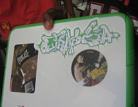
OLPC XO BTest-3 in use
Have you seen the One Laptop Per Child computers in the wild? The BTest-3 Children's Machine XO that arrived mid-May at OLPC headquarters and incorporates swank new features like:
A clean line on the battery housing and thinned out plastic on the front bezel for "glowing" camera and microphone "in-use" indicators. Improvements for robustness include: a steel plate in the keyboard area; a smaller battery cavity; rubber "bunny ears", thicker bumpers and ribbing made out of pure polycarbonate, a longer keyboard cable, and a water resistance in touch-pad area.For me and many others, the most prominent new feature is the brightly colored XO on the back cover of the laptop that has 400 unique XO color combinations. This big XO is much louder than personalizing stickers and really makes the OLPC XO stand out in the classroom.Improvements for usage include: increased display tilt; improved keyboard feel and responsiveness; improved touch-pad responsiveness; a gray bezel around the display; improved fit and finish of the buttons; X and O indicators on the touch-pad buttons
And while I know people will think I'm OLPC bashing when I say this, I have a very honest concern: isn't the XO upside down?
Really, look at the XO icon when its in use. Do you see the "head" is below the "body", like the OLPC icon was designed to be right-side up when carried, but not when in use?
See how others orientate their laptop stickers - even OLPC stickers. They place them to be right-side up when the laptop is on a desk. This is 180 degrees different from the orientation when held by a handle near the hinge.
Could this really be an intentional OLPC design, an upside down icon when the XO computer is in use? Or is this a design error made in the rush to meet the September production deadline?
Either way, every time I see a student using a BTest-3, I wonder why the "XO child" is doing a headstand.


Yeah, aesthetics are important. They should probably put another screen there and an Accelerometer so they could automatically re-orient XO.
Very good point.
i think an accelerometer would be overkill
just make the XO spin around with a weight on the "feet" to keep orientated "heads-up"
"just make the XO spin around with a weight on the "feet" to keep orientated "heads-up""
That would be moving parts. Which might not a good idea in the target areas. Detachable inset?
But this might end up to be a Bike-shed-color problem ;-)
Winter
Since this isn't the only laptop with a logo on the lid, no one need invent a new way of laying out the design. Apple puts their logo on their laptops so they are oriented up when the laptop is open. Dell does the same.
If it's good enough for Dell and Apple, should be good enough for OLPC!
Djeef
Djeef,
OLPC is a leader! Not a follower.
> OLPC is a leader! Not a follower.
Oh dear. The project better succeed then, or else we are ALL DOOMED.
"Really, look at the XO icon when its in use. Do you see the "head" is below the "body", like the OLPC icon was designed to be right-side up when carried, but not when in use?"
The current design makes sense. Ask yourself - when will the XO icon be more prominently displayed? It's obvious it's when a kid carries his/her XO around.
Just as a reminder, older Apple machines had the logo upside down when open like this as well. The reason that was always given was that the logo was for the user, not the audience. When you close the laptop, you see the logo, right side up. Apple has now switched to the way everyone else does it, most likely because they saw the value in using it as a little bit of additional free advertising.
I kind of like that these are upside-down, and therefore, intentionally or not, user-centric, but if the logo starts being recognizeable to the normal population, and sales or recognition are a good thing for the project, it should most likely be flipped the other way around.
Ian
Come on guys-it's a handstand or cartwheel! Such athletic twirls are of course largely the domain of the young & nimble,& they universally represent an expression of youthful versatility, prowess & happiness. Mmm- right on the XO target!
Thank goodness someone has raised this design error. The logo was added to help identify laptops to their users. This situation is most important when trying to teach a room full of students hidden behind their screens. The current design will hide the second coloured element when children are sat in rows- hence hampering the teacher from identifying the child in question.
There are indeed further design problems, such as the culture specific 'Tick' now on the gamepad (Maru anyone?) and the LED indicators on the both sides of the laptop (consuming sufficient power drain to be of concern to the hardware developers).
I wonder if OLPC designers ever read these comments?...
Andrew,
OLPC developers do read OLPC News, which is one reason I bring up these topics - to show them there might be other views on their work.
You bring up and interesting view, that of the teacher using the icon to identify the student behind the computer. I had not thought of that and doubt the OLPC people did as they are very child, vs teacher, focused. Its a good point.
And while I see folks have enjoyed this post, I do really think the upside down OLPC icon an odd design & until better explained, consider it... "flaw" is too strong, maybe "unique" or "different".
This is obviously a matter of the greatest importance. If the child cannot correctly read the XO symbol, then he is likely to accidently pick up one of his many other laptops and bring it to school, causing great educational confusion.
I think everyone is missing the obviously here: The XO was designed so that it can be read upside down. The Children's Machine is the 'Ox'. In the Chinese zodiac, the ox is noted as follows:
People born in the Year of the Ox are patient, speak little, and inspire confidence in others. They tend, however, to be eccentric, and bigoted, and they anger easily. They have fierce tempers and although they speak little, when they do they are quite eloquent. Ox people are mentally and physically alert. Generally easy-going, they can be remarkably stubborn, and they hate to fail or be opposed. They are most compatible with Snake, Rooster, and Rat people.
For what it's worth, the next year of the ox is 2009 (perhaps when we finally see the OLPC in mass production?).
(fyi for those Negroponte bashers who frequent this board: He was born in the year of the ram, so this doesn't appear to be self-referential.)
Conspiracy theorists who hang out in the Tahi blogosphere (I am sure there are a few of you here, no?) will note that this could be a reference to former Thai president Thaksin, as a ploy to get Thai buy-in for the OLPC. I tend to discount this theory personally, but I would be remiss if I did not flag it.
Critics (in Santa Clara? Redmond?) may note that the Ox is typically castrated. Wags may note that an Ox may conjure images of a sacred cow -- something not to be criticized. (insert appropriate Negroponte quote from OLPCtalks here about people who criticize the OLPC)
The Ox is also the nickname of the late Who bass player John Entwhistle. Mssrs Negroponte and Bender are rumored to be fans of the rock and roll hall of famer, and it is conceivable that this is an oblique reference to the song 'sqeeze box' (i.e. all the goods things in a laptop, sqezed into a smaller package) which was for a time on heavy iTunes rotation at OLPC headquarters.
Or maybe I am reading too much into this.
-Franklin
This is an old thread but I wanted to point out that IBM has it's logo [mostly] right side up when the Thinkpad lid is closed. There may be others as well.
FWIW: I thought the same thing the first time I walked past the table where my XO sat open. "The logo is upside-down!"
But then I thought some more. Unlike other laptops, the xo has handle. When a child is outdoors, carying the XO by its handle, the logo is right-side-up. People who are unconnected with the project or the school system will see the logo as it's supposed to appear. When the child is IN school using the XO, and it's unlikely that there will be "new" people seeing the XO, the logo is wrong-side-up.
So if they had to choose between orienting the logo so it's right-side-up while it's out in public, or indoors being used, they made the right choice. Out in public is where the new sets of eyes are -- eyes belonging to people who might be seeing an XO for the first time.