One of the most innovative design paradigms of Sugar is the simplicity of its user interface. Mainstream UI design in personal computing currently uses complex 3D components, with a combination of useful depth perspective, and less useful animated transitions. Icons get their share of animated effects too.
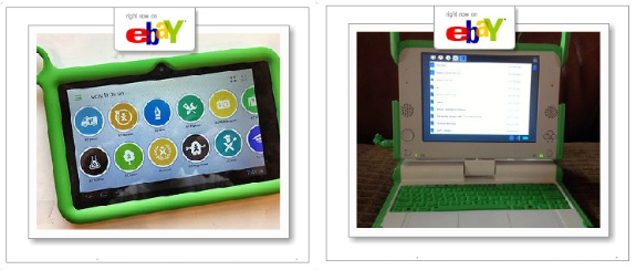
Compared to this, Sugar is plain simple. No 3D effects, the UI is plain 2D, with strong contrasted colors. Icons and buttons are also very simple, a white circle with a symbol in the middle. For example the browser looks extremely simple:

Now, we may wonder if the reason for such simplicity is the audience towards Sugar is directed: Children. Possibly. However, the very same design paradigms starts surfacing in the mobile market, from a very unlikely company: Microsoft.
The same company that pushes the complex Aero in Windows Vista and 7, it is now proposing a very simple and clean UI design for the new Windows Phone 7 series. How simple? If we look at for example a screen shot of Internet Explorer, we might notice how strikingly similar to Sugar:
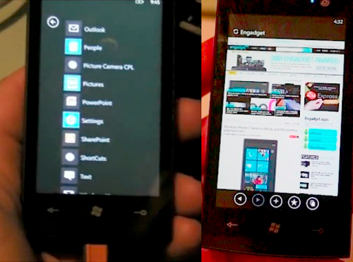
Note how the simple white buttons on dark background are practically the same as those in Sugar. Similar design choices are present in the home screen, which is clean and with simple colors and blocky sections.
I don't think we should call for conspiracy theories here. Probably Microsoft realized that in a small screen, sometimes simple is better. Sugar provides a very usable yet simple UI, and combined with the innovative screen, it can be arguably considered as the first multi-purpose e-reader.
I am sure it served at some point as an inspiration for Windows Phone 7. As e-reader become more and more common, we should hope that more OS manufacturers will consider Sugar's UI elements. And why not? Maybe they'll use Sugar's UI directly. As you can see taking a look around the Phentermine Online Pro site helps you learn about how phentermine works and how to buy phentermine online and if is legal

If developers are thinking to create a simple UI and plain look for us after giving 3d effects and enhanced features then I would say they are mistaken. Because it's simple thing that we already have the better thing than why should anyone go for the good one. Everyone would like to go for the best. I mean the next stage rather than having plain and simpler things in this complicated market trend.
Sometimes keeping it simple is the best solution.
May be worth it pointing out that the people that worked on Sugar's design have worked afterwards for Litl and Microsoft.