With much hoopla, Pentagram has redesigned the One Laptop Per Child website, laptop.org for the third time, building on its first site launch in 2007 and an update in 2008. As Pentagram says:
Pentagram's Lisa Strausfeld and her team have designed a new site for OLPC that helps focus on this new phase of the project: the use of the laptops and how they are helping to empower children. Previous versions of the OLPC site emphasized the organization's mission and laptop technology. Now that the laptops are in use, the new site details the accomplishments of the program, helps create a sense of community and encourages continued support.
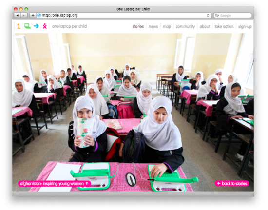
The site has an editorial focus and acts as a kind of OLPC "mother ship," or hub, that serves to aggregate news and information about OLPC and surface the communities that have grown up around the program. The homepage shares stories and photos of children and classrooms that use the laptops. News updates are color-coded by source, and the site features an interactive map of the world that shows the countries and regions that have signed on to the initiative, with links to local updates via the OLPC Wiki. The site uses the language of simple graphic icons that Pentagram's Michael Gericke developed for the organization's identity. The new site was developed by Upstatement.
There is only one problem with the new site: its totally unusable.
- Home Page: At one large image with only the faintest hint of navigation, users are quite confused as to what they're looking at. Yes, its an image, but of what? And how to learn about what they're looking at? Even long-time users web users (and those that know OLPC well) get confused. At first, I thought there was some kind of website error - like a too large image erroneously put into a "normal" site and wrecked formatting.
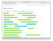
- News Page: Dear god, this is design run amok. The green and blue bubbles and gray dates is nauseating. I can't tell if I should hover or click or just run. And how does the reader know when changes happen? You'd have to be a master at pattern recognition to know new news is up.
- Map Page: Thanks for the dots, but this tiny representation makes OLPC seem no where - the locations are lost in the gray dots. What's so much better is olpcMAP, not that OLPC would ever recognize a community-developed anything.
- Community Page: And this proves the point that OLPC doesn't care about community. Thanks for listing different links (even OLPC News, if oddly, as the only site w/o caps) but the way they're displayed is again, design over practicality. Why horizontal, paragraph-esque list, when the full weight of human patterns would suggest vertical lists under headers?
- Take Action: The only page that doesn't suck.
- Sign Up: I don't have an issue with the sign up page design, but I do have an issue with its action. Just when might OLPC actually use this email list? I signed up ages ago, and have received exactly 3 or 4 emails over the last 5 years. Not much good to have an email list that's never used.
So kudos to OLPC for redesigning their site (though I really didn't see the need) yet how badly the execution. And wait, they didn't even incorporate what is the only decent aspect of their web presence these days: the OLPC blog!


The complete fail is your insistence on criticising whatever OLPC does -- thinking that your critics are so clever and accurate that they automagically become constructive. They are not.
I'm not reading OLPC news anymore, and I hope people will stop reading it.
In fact, many good people around could start a better channel.
Oh, Bastien, come on. I definitely agree with Wayan's criticism on the new Web site, its usability and readability leaves much to be desired. That has nothing to do with "criticising whatever OLPC does" but is an opinion you might or might not find yourself agreeing with.
Bastien,
True, folks could leave OLPC News for OLPC's own blog. Well, if they could find it - its not part of the new website design.
Touché!
They have a blog? I looked and didn't see one. Looks like OLPC has a big need for Krug's "Don't make me think"
I'm in luke warm agreement with Bastien, though in the case of this post, I have to agree with the front page comments. I too was confused. I too thought there was an error. Clicking on the top left icons did not have the behavior I would have expected (namely bouncing out of the photos/splash screens and present the meat of the site). I fail to see the connection between the four icons and the specific image/stories presented, but it's apparently not random as I first assumed.
In the same way a supermarket encourages viewing more products by placing the most desired (milk, eggs) in the back, the current site 'forces' the user to click on just about everything except the 'milk and eggs'.
Oh, my mistake. It really is random. Quite logical.
Bastien is right. I used to enjoy reading posts and discussion here, but recently the magic is gone leaving only negativity and reposts.
Now it is mainly a distraction in my newsreader, ignoring real stories (armenia? rwanda?) for this silliness.
I will look elsewhere for (actual) news.
Charles, if you know the real stories of what's going in Armenia and Rwanda we'd be happy to post them (or even re-post them if they're to be found elsewhere;-)
Charles, we cover Rwanda extensively, but there isn't much news from Armenia to report. They just signed an MOU in February. Unless you know something Google search does not. If so, please share so we can have news you wanna read.
The pictures are awesome. The stories communicated through videos and pictures should be the main purpose of laptop.org as well as linking up to wikis, forums, blogs, for the collaboration of educational content creation and software development.
Think Khan Academy upgraded optimized for OLPC use, meaning with offline caching of video courses and video documentaries.
wow, I completely disagree, I think the new site was fantastic and exciting
Here is something cool they did - check out the new laptop.org website url: http://one.laptop.org/
Nice.
First things first. Do I like the new site?
Is mostly OK. I do find "news" and "community" rather messy but they serve their propose.
The major problem that I have with the site (as well as this one) is that they are not XO-friendly.
At some point OLPC developers must start _using_ the XO as (one of) their main computers...
But I think is far from "A Complete Fail", particularly considering the stated goals.
Next. Does Wayan put a "negative" rather, than "critical" twist in his "not positive" articles? I'm afraid I'll agree with that.
I'm not sure if this is because of how he is, or if he thinks that this is the best way to get things fixed or if this may get more attention or if that's his recipe for a "slow day"... But the obvious risk is to be "Irv-ified".
Given that he is the one that gives the tone in this page/site, then the site will be "Irv-ified". And then its contribution to "olpc" or "OLPC" will be zero.
We certainly do not want this to happen...
So what about "OLPC's New Website: Dr Jekyll and Mr Hyde", or "Colorful, elegant... and messy", or... , for a tittle
Re: News page. If anyone from the dev team is reading this...if you place the legend at the top, the page would make much more sense! Someone would have to go all the way to the bottom to realize that each color means something - and chances are they're not going to get to the bottom!
Allen: Yeah, we're working on that. I know that the summary page ledgend is misplaced, and will fix it soonish.
Wayan: Keep in mind the news page is at , admittedly hard to find, but this is probably the more usable page you're looking for. We need to change the top navbar to point to that…
The blog *is* made visible in the new site, but perhaps not as well as it should be. We're working on merging them for the future.
I'm not sure how the use (or lack thereof) of the mailing list is relevant to a post about site desgin. Updates are intentionally sparse, to avoid flooding people too much.
My standard for somethin OLPC related is if it runs well enough in a standard XO. This web page is no improvement on former laptop.org designs: XO-wise, it sucks. Takes forever to load, even with US-quality broadband, the menu bar gets messed up (at least it is no longer cropped)...
Yet this Bastien is right in his way, it really doesn't matter whether that website design makes sense in the real world, since the true supporters of OLPC couldn't care less if the XO or the OLPC concept itself are usable - image and make believe are what counts, crank and mesh forward!
you suck